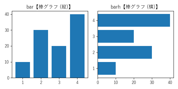
bar【棒グラフ (縦)】
barh【棒グラフ (横)】
メモ ( 基本 グループ化 積み上げ棒グラフ 極座標グラフ 3D棒グラフ 関連設定 ) 構文 設定・グラフパーツ 例
メモ
基本
〔 例 〕- 座標を元に、棒グラフを描画
縦方向:bar【棒グラフ (縦)】構文
横方向:barh【棒グラフ (横)】構文 - 値の描画:bar_label【バーラベル】
- 負数指定で下(左)方向 (ゼロ軸:axhline【x軸追加】・axvline【y軸追加】)
- 均一の幅 (高さ) 以外も可能 ( width (bar【棒グラフ (縦)】の幅) ・height (barh【棒グラフ (横)】の高さ))
- barh【棒グラフ (横)】で上から下に描画:axes.Axes.invert_yaxis【y軸方向反転】でy軸方向を反転
(x軸方向反転:axes.Axes.invert_xaxis【x軸方向反転】) - エラーバー (誤差範囲) の追加も可 (xerr (エラーバー) ・yerr (エラーバー) ・ecolor (エラーバーの色))
データの指定方法
- 通常指定
- 引数にデータを指定
- ラベル名指定
- 引数にラベル名を指定
- data (ラベル名指定データ)にラベル名とデータを指定
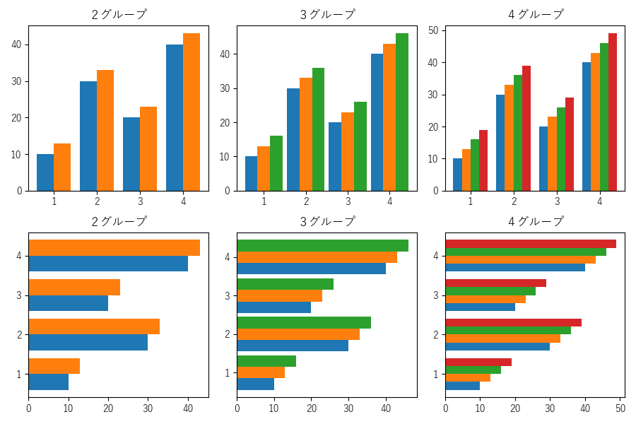
グループ化 (複数の棒グラフをまとめて描画)
〔 例 〕- 重ならないように、x(y)座標の位置を左右(上下)にずらして描画
- align (bar:バーの位置合わせ) ・align (barh:バーの位置合わせ) を 'edge'【左(下)端をx(y)位置に配置】に指定
但し、奇数グループの中央はalign (バーの位置合わせ)を 'center'【中央に配置】に指定 - 中央より左(下)側のバーの width (bar:バーの幅) ・height (barh:バーの高さ を負数指定
- バーの位置を左右(上下)に移動
- align (bar:バーの位置合わせ) ・align (barh:バーの位置合わせ) を 'edge'【左(下)端をx(y)位置に配置】に指定
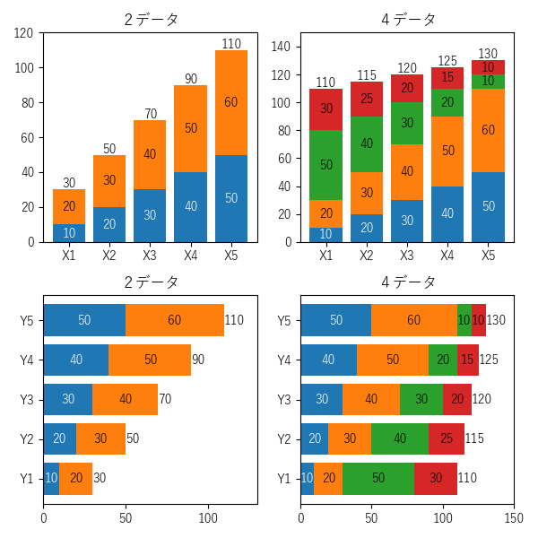
積み上げ棒グラフ
〔 例 〕- bottom (下端)・left (左端)の指定で積み上げが可能
- 値の描画:bar_label【バーラベル】(label_type='center' 指定)
- 合計値の描画:bar_label【バーラベル】(label_type=省略 / 'edge' 指定)
極座標グラフ
- 極座標に描画可能
- plt.subplot(projection='polar')
plt.subplot(polar=True) - 円グラフ・ドーナツチャートの描画も可能
3D棒グラフ
- plt.figure().add_subplot(projection='3d')
関連設定
〔 例 〕- タイトル・凡例・目盛り等:設定・グラフパーツ 参照
関連
- broken_barh【棒グラフ (水平シーケンス)】
- pie【円グラフ】
- hist【ヒストグラム】
外部リンク
構文
bar【棒グラフ (縦)】
matplotlib.pyplot.bar(
    x (バーのx座標)※data,
    height (バーの高さ)※data,
    width (バーの幅)※data =0.8,
    bottom (下端のy座標)※data =None,
    *,
    align (str:バーの位置合わせ)※data ='center',
    data (ラベル名指定データ)=None,
    **kwargs (バーオプション)※data)
matplotlib.axes.Axes.bar(同上)
戻り値BarContainer【バーコンテナ】

x (float | 配列形式)※dataバーのx座標
height (float | 配列形式)※dataバーの高さ (正数:上方向 / 負数:下方向)
width (float | 配列形式)※dataバーの幅 (負数も可:align参照)
bottom (float | 配列形式)※data下端のy座標
align (str) キーワード引数※dataバーの位置合わせ
    'center':x位置の中央に配置
    'edge':左端をx位置に配置 (width (バーの幅)が負数:右端を配置x位置)
data (キーワード引数)ラベル名指定データ
(※data:ラベル名指定可・詳細は、データの指定方法 参照・全ての引数が対象)
kwargs (可変長キーワード引数)バーオプション・Rectangle【長方形】のプロパティ
barh【棒グラフ (横)】
matplotlib.pyplot.barh(
    y (バーのy座標)※data,
    width (バーの幅)※data,
    height (バーの高さ)※data =0.8,
    left (左端のx座標)※data =None,
    *,
    align (str:バーの位置合わせ)※data ='center',
    data (ラベル名指定データ)=None,
    **kwargs (バーオプション)※data)
matplotlib.axes.Axes.barh(同上)
戻り値BarContainer【バーコンテナ】

y (float | 配列形式)※dataバーのy座標
width (float | 配列形式)※dataバーの幅 (正数:右方向 / 負数:左方向)
height (float | 配列形式)※dataバーの高さ (負数も可:align参照)
left (float | 配列形式)※data左端のx座標
align (str) キーワード引数※dataバーの位置合わせ
    'center':y位置の中央に配置
    'edge':下端をy位置に配置 (height (バーの高さ)が負数:上端をy位置に配置)
data (キーワード引数)ラベル名指定データ
(※data:ラベル名指定可・詳細は、データの指定方法 参照・全ての引数が対象)
kwargs (可変長キーワード引数)バーオプション・Rectangle【長方形】のプロパティ
バーオプション
| kwargs (可変長キーワード引数) | 型 | デフォルト | 備考 |
|---|---|---|---|
| capsize | float | rcParams["errorbar.capsize"] (デフォルト値:0.0) | エラーバーの長さの上限 (ポイント) |
| color ※ | color【色定義】 list( color【色定義】 ) | バーの色 | |
| ecolor | color【色定義】 list( color【色定義】 ) | 'black' | エラーバーの色 |
| edgecolor ※ | color【色定義】 list( color【色定義】 ) | バーの端の色 | |
| error_kw | dict | errorbar メソッドの引数 | |
| linewidth ※ | float 配列形式 | バーの端の幅 | |
| log | bool | False | x軸の対数スケール設定有無 |
| tick_label | str list( str ) | None:数値ラベル使用 | バー目盛りのラベル |
| xerr | float shape(N,) 配列形式 shape(2, N) 配列形式 None | None:なし | エラーバー |
| yerr |
※:Rectangle【長方形】のプロパティを拡張
Rectangle【長方形】のプロパティ
| プロパティ | 型 | デフォルト | 取得 | 設定 | 備考 | ||||||||||||||||||||||
|---|---|---|---|---|---|---|---|---|---|---|---|---|---|---|---|---|---|---|---|---|---|---|---|---|---|---|---|
| agg_filter | ○ | ○ | agg フィルター | ||||||||||||||||||||||||
| alpha | scalar None | ○ | ○ | アルファ値 (0:透明 ~ 1:不透明) | |||||||||||||||||||||||
| animated | bool | ○ | ○ | アニメーション使用の有無 | |||||||||||||||||||||||
| antialiased aa 3.1 | bool | ○ | ○ | アンチエイリアス処理の有無 | |||||||||||||||||||||||
| capstyle | CapStyle 3.4 str | ○ | ○ | 線端スタイル
| |||||||||||||||||||||||
| clip_box | Bbox | ○ | ○ | ||||||||||||||||||||||||
| clip_on | bool | ○ | ○ | ||||||||||||||||||||||||
| clip_path | Patch (Path, Transform) None | ○ | ○ | ||||||||||||||||||||||||
| color | color【色定義】 | ○ | ○ | edgecolor【外枠の色】・facecolor【前景色】 | |||||||||||||||||||||||
| contains 3.3 | callable | ○ | ○ | ピッカーイベント (参照:picker【ピッカーイベント】) | |||||||||||||||||||||||
| edgecolor ec 3.1 | color【色定義】 None 'auto' | ○ | ○ | 外枠の色 | |||||||||||||||||||||||
| facecolor fc 3.1 | color【色定義】 None | ○ | ○ | 前景色 | |||||||||||||||||||||||
| figure | Figure | ○ | ○ | 所属フィギュア | |||||||||||||||||||||||
| fill | bool | ○ | ○ | 塗りつぶしの有無 | |||||||||||||||||||||||
| gid | str | ○ | ○ | グループID | |||||||||||||||||||||||
| hatch | str | ○ | ○ | 塗りつぶしパターン (繰り返しで高密度 / 組合せ可)
| |||||||||||||||||||||||
| in_layout | bool | ○ | ○ | レイアウト計算に含めるか否か | |||||||||||||||||||||||
| joinstyle | JoinStyle 3.4 str | ○ | ○ | 結合スタイル
| |||||||||||||||||||||||
| label | object | ○ | ○ | 凡例ラベル (アンダースコアで始まるラベルは対象外) | |||||||||||||||||||||||
| linestyle ls 3.1 | str (offset, on-off-seq) | ○ | ○ | 線種
| |||||||||||||||||||||||
| linewidth lw 3.1 | float None | ○ | ○ | 外枠の幅 | |||||||||||||||||||||||
| path_effects | AbstractPathEffect | ○ | ○ | ||||||||||||||||||||||||
| picker | None bool float callable | None | ○ | ○ | None:ピッカーイベントなし bool:ピッカーイベント有無 float:ピッカー範囲 callable:ピッカーイベント | ||||||||||||||||||||||
| rasterized | bool | ○ | ○ | ラスタライズ有無 | |||||||||||||||||||||||
| sketch_params | ○ | ○ | (scale: float, length: float, randomness: float) | ||||||||||||||||||||||||
| snap | bool None | ○ | ○ | スナップ (ピクセル位置補正) の有無 (Agg・MacOSX バックエンドのみサポート) | |||||||||||||||||||||||
| transform | Transform | ○ | ○ | ||||||||||||||||||||||||
| url | str | ○ | ○ | ハイパーリンクURL (SVG のみ対応) | |||||||||||||||||||||||
| visible | bool | ○ | ○ | 表示有無 | |||||||||||||||||||||||
| zorder | float | ○ | ○ | Zオーダー (大きい方が手前) | |||||||||||||||||||||||


設定・グラフパーツ
| pyplot. | axes.Axes. | その他 | |
|---|---|---|---|
| タイトル | suptitle【タイトル設定 (全体)】 title【タイトル設定】 | set_title【タイトル設定】 get_title【タイトル取得】 Axes3D.set_title【タイトル設定】 | figure.Figure.suptitle【タイトル設定 (全体)】 figure.SubFigure.suptitle figure.Figure.align_titles【タイトル調整】3.9 |
| 凡例 | legend【凡例 設定】3.5 / 3.7 / 3.8 quiverkey【ベクトルの凡例 追加】 | figure.Figure.legend【凡例 設定 (全体)】3.7 / 3.8 PathCollection.legend_elements【凡例項目作成】 | |
| get_legend【凡例 取得】 get_legend_handles_labels【凡例 取得 (ハンドル・ラベル)】 | |||
| 軸ラベル | xlabel【x軸ラベル 設定】3.3 ylabel【y軸ラベル 設定】3.3 | set_xlabel【x軸ラベル 設定】3.3 set_ylabel【y軸ラベル 設定】3.3 Axes3D.set_zlabel【z軸ラベル 設定】 get_xlabel【x軸ラベル 取得】 get_ylabel【y軸ラベル 取得】 Axes3D.get_zlabel【z軸ラベル 取得】 | align_labels【ラベル調整】 figure.Figure.supxlabel【x軸ラベル(全体) 設定】3.43.6 figure.Figure.supylabel【y軸ラベル(全体) 設定】3.43.6 figure.SubFigure.supxlabel figure.SubFigure.supylabel projections.polar.PolarAxes.set_rlabel_position【半径ラベルのシータ位置設定】 |
| clabel【等高線ラベル 設定】 | |||
| グリッド線 | grid【グリッド線 設定】3.5 | grid【グリッド線 設定】3.5 get_xgridlines【x軸グリッド線 取得】 get_ygridlines【y軸グリッド線 取得】 (Axes3D.grid【3Dグリッド線 取得・設定】) Axes3D.get_zgridlines【z軸グリッド線 取得】 | axis.Axis.grid【軸グリッド線 設定】3.5 axis.Axis.get_gridlines【軸グリッド線 取得】 |
| triplot【三角形分割】 | |||
| rgrids【放射状グリッド線 取得・設定】 thetagrid【放射状シータグリッド線 取得・設定】 | projections.polar.PolarAxes.set_rgrids【放射状グリッド線 設定】 projections.polar.PolarAxes.set_thetagrid【放射状シータグリッド線 設定】 | ||
| 表示範囲 | xlim【x軸表示範囲 取得・設定】 ylim【y軸表示範囲 取得・設定】 axis【表示範囲等 取得・設定】3.1~3.4 / 3.7 | set_xlim【x軸表示範囲 設定】3.1 / 3.6 set_ylim【y軸表示範囲 設定】3.1 / 3.6 get_xlim【x軸表示範囲 取得】 get_ylim【y軸表示範囲 取得】 axis【表示範囲等 取得・設定】3.1~3.4 / 3.7 | projections.polar.PolarAxes.set_rlim【極座標範囲 設定】 |
| Axes3D.set_xlim【3D x軸表示範囲 設定】 Axes3D.set_xlim3d【3D x軸表示範囲 設定】 Axes3D.set_ylim【3D y軸表示範囲 設定】 Axes3D.set_ylim3d【3D y軸表示範囲 設定】 Axes3D.set_zlim【3D z軸表示範囲 設定】 Axes3D.set_zlim3d【3D z軸表示範囲 設定】 Axes3D.get_xlim3d【3D x軸表示範囲 取得】 Axes3D.get_ylim3d【3D y軸表示範囲 取得】 Axes3D.get_zlim3d【3D z軸表示範囲 取得】 | |||
| データ上限・下限 | set_xbound【x軸データ上限・下限 設定】 set_ybound【y軸データ上限・下限 設定】 get_xbound【x軸データ上限・下限 取得】 get_ybound【y軸データ上限・下限 取得】 | projections.polar.PolarAxes.set_rmax【極座標上限 設定】 projections.polar.PolarAxes.set_rmin【極座標下限 設定】 | |
| 目盛り | xticks【x軸目盛り (ラベル) 取得・設定】3.6 yticks【y軸目盛り (ラベル) 取得・設定】3.6 locator_params【目盛り制御】 minorticks_on minorticks_off ticklabel_format【目盛りフォーマット設定 (指数形式)】 tick_params【目盛り・グリッド線 外観変更】 | set_xticks【x軸目盛り 設定】3.2 / 3.5 set_yticks【y軸目盛り 設定】3.2 / 3.5 Axes3D.set_zticks【z軸目盛り 設定】 set_xticklabels【x軸目盛りラベル 設定】3.3 / 3.5 set_yticklabels【y軸目盛りラベル 設定】3.3 / 3.5 Axes3D.set_zticklabels【z軸目盛りラベル 設定】 get_xticks【x軸目盛り 取得】3.2 get_yticks【y軸目盛り 取得】3.2 Axes3D.get_zticks【z軸目盛り 取得】 get_xticklabels【x軸目盛りラベル 取得】3.3 / 3.6 get_yticklabels【y軸目盛りラベル 取得】3.3 / 3.6 Axes3D.get_zticklabels【z軸目盛りラベル 取得】 get_xmajorticklabels【x軸目盛りラベル 取得 (主)】3.3 / 3.6 get_ymajorticklabels【y軸目盛りラベル 取得 (主)】3.3 / 3.6 get_xminorticklabels【x軸目盛りラベル 取得 (補助)】3.3 / 3.6 get_yminorticklabels【y軸目盛りラベル 取得 (補助)】3.3 / 3.6 get_xticklines get_yticklines xaxis_date yaxis_date minorticks_on minorticks_off ticklabel_format【目盛りフォーマット設定 (指数形式)】 tick_params【目盛り・グリッド線 外観変更】 locator_params【目盛り制御】 fmt_xdata fmt_ydata | ticker【目盛りモジュール】 axis.Axis.set_ticks【目盛り 設定】 axis.Axis.set_ticklabels【目盛りラベル 設定】 axis.Axis.set_tick_params【目盛り・グリッド線 外観変更】 axis.XAxis.set_ticks_position【x軸目盛り位置 設定】 axis.YAxis.set_ticks_position【y軸目盛り位置 設定】 Axes3D.locator_params【目盛り制御】 axis.Axis.set_major_formatter【フォーマッタ設定 (主)】 axis.Axis.set_minor_formatter【フォーマッタ設定 (補助)】 axis.Axis.set_major_locator【ロケータ設定 (主)】 axis.Axis.set_minor_locator【ロケータ設定 (補助)】 axis.Axis.get_ticklabels【目盛りラベル取得】 axis.Axis.get_majorticklabels【目盛りラベル取得 (主)】 axis.Axis.get_minorticklabels【目盛りラベル取得 (補助)】 axis.Axis.get_major_formatter【フォーマッタ取得 (主)】 axis.Axis.get_minor_formatter【フォーマッタ取得 (補助)】 axis.Axis.get_ticklocs axis.Axis.get_major_locator【ロケータ取得 (主)】 axis.Axis.get_minor_locator【ロケータ取得 (補助)】 figure.Figure.autofmt_xdate【x軸日付目盛りラベル回転】 axis.Axis.get_tick_params【目盛り・グリッド線 外観取得】3.7 |
| 直線 範囲 | axhline【水平線 (単一)】3.9 axvline【垂直線 (単一)】 hlines【水平線 (複数)】3.3 vlines【垂直線 (複数)】3.3 axhspan【水平範囲】3.9 axvspan【垂直範囲】3.9 axline【直線】3.3 | ||
| 軸方向 | invert_xaxis【x軸方向反転】 xaxis_inverted【x軸方向取得】 invert_yaxis【y軸方向反転】 yaxis_inverted【y軸方向取得】 | ||
例
基本

import matplotlib.pyplot as plt

# 初期設定
plt.rcParams['font.family'] = 'sans-serif'
plt.rcParams['font.sans-serif'] =\
    ['Yu Gothic', 'Hiragino Maru Gothic Pro', 'Noto Sans CJK JP']
fig, axs = plt.subplots(
    2, 3,
    figsize=(9, 6),
    tight_layout=True,
)

# bar【棒グラフ (縦)】(左)
x = [1, 2, 3, 4]
height_0 = [10, 30, 20, 40]
bar_0 = axs[0, 0].bar(
    x,
    height_0,
)
axs[0, 0].set_title('bar【棒グラフ (縦)】')
axs[0, 0].bar_label(bar_0, padding=5)
axs[0, 0].set_ylim(0, 50)

# bar【棒グラフ (縦)】(中央:負数指定・幅変更)
height_1 = [-10, 30, -20, 40]
bar_1 = axs[0, 1].bar(
    x,
    height_1,
    width=[0.4, 0.6, 0.8, 1],
)
axs[0, 1].set_title('bar (負数指定・幅変更)')
axs[0, 1].bar_label(bar_1, padding=5)
axs[0, 1].set_ylim(-30, 50)
axs[0, 1].axhline(0)

# bar【棒グラフ (縦)】(右:軸方向反転・エラーバー)
height_2 = [10, 30, 20, 40]
bar_2 = axs[0, 2].bar(
    x,
    height_2,
    ecolor='red',
    yerr=4,
)
axs[0, 2].set_title('bar (軸方向反転・エラーバー)')
axs[0, 2].bar_label(bar_2, padding=5)
axs[0, 2].set_ylim(0, 50)
axs[0, 2].invert_xaxis()

# barh【棒グラフ (横)】(左)
y = [1, 2, 3, 4]
width_0 = [10, 30, 20, 40]
barh_0 = axs[1, 0].barh(
    y,
    width_0,
)
axs[1, 0].set_title('barh【棒グラフ (横)】')
axs[1, 0].bar_label(barh_0, padding=5)
axs[1, 0].set_xlim(0, 50)

# barh【棒グラフ (横)】(中央:負数指定・高さ変更)
width_1 = [-10, 30, -20, 40]
barh_1 = axs[1, 1].barh(
    y,
    width_1,
    height=[0.4, 0.6, 0.8, 1],
)
axs[1, 1].set_title('barh (負数指定・高さ変更)')
axs[1, 1].bar_label(barh_1, padding=5)
axs[1, 1].set_xlim(-30, 50)
axs[1, 1].axvline(0)

# barh【棒グラフ (横)】(右:軸方向反転・エラーバー)
width_2 = [10, 30, 20, 40]
barh_2 = axs[1, 2].barh(
    y,
    width_2,
    ecolor='red',
    xerr=4,
)
axs[1, 2].set_title('barh (軸方向反転・エラーバー)')
axs[1, 2].bar_label(barh_2, padding=5)
axs[1, 2].set_xlim(0, 50)
axs[1, 2].invert_yaxis()

# 表示
plt.show()
グループ化
import matplotlib.pyplot as plt
import numpy as np

# 初期設定
plt.rcParams['font.family'] = 'sans-serif'
plt.rcParams['font.sans-serif'] =\
    ['Yu Gothic', 'Hiragino Maru Gothic Pro', 'Noto Sans CJK JP']
fig, axs = plt.subplots(
    2, 3,
    figsize=(9, 6),
    tight_layout=True,
)

# データ
x = np.array([1, 2, 3, 4])
height_1 = [10, 30, 20, 40]
height_2 = [13, 33, 23, 43]
height_3 = [16, 36, 26, 46]
height_4 = [19, 39, 29, 49]
y = np.array([1, 2, 3, 4])
width_1 = [10, 30, 20, 40]
width_2 = [13, 33, 23, 43]
width_3 = [16, 36, 26, 46]
width_4 = [19, 39, 29, 49]

# bar【棒グラフ (縦)】2グループ
axs[0, 0].set_title('2グループ')
WIDTH_0 = 0.4
axs[0, 0].bar(
    x,
    height_1,
    align='edge',
    width=(-WIDTH_0),
)
axs[0, 0].bar(
    x,
    height_2,
    align='edge',
    width=WIDTH_0,
)

# bar【棒グラフ (縦)】3グループ
axs[0, 1].set_title('3グループ')
WIDTH_1 = 0.3
axs[0, 1].bar(
    x - WIDTH_1 * 0.5,
    height_1,
    align='edge',
    width=(-WIDTH_1),
)
axs[0, 1].bar(
    x,
    height_2,
    align='center',
    width=WIDTH_1,
)
axs[0, 1].bar(
    x + WIDTH_1 * 0.5,
    height_3,
    align='edge',
    width=WIDTH_1,
)

# bar【棒グラフ (縦)】4グループ
axs[0, 2].set_title('4グループ')
WIDTH_2 = 0.2
axs[0, 2].bar(
    x - WIDTH_2,
    height_1,
    align='edge',
    width=(-WIDTH_2),
)
axs[0, 2].bar(
    x,
    height_2,
    align='edge',
    width=(-WIDTH_2),
)
axs[0, 2].bar(
    x,
    height_3,
    align='edge',
    width=WIDTH_2,
)
axs[0, 2].bar(
    x + WIDTH_2,
    height_4,
    align='edge',
    width=WIDTH_2,
)

# barh【棒グラフ (横)】2グループ
axs[1, 0].set_title('2グループ')
HEIGHT_0 = 0.4
axs[1, 0].barh(
    y,
    width_1,
    align='edge',
    height=(-HEIGHT_0),
)
axs[1, 0].barh(
    y,
    width_2,
    align='edge',
    height=HEIGHT_0,
)

# barh【棒グラフ (横)】3グループ
axs[1, 1].set_title('3グループ')
HEIGHT_1 = 0.3
axs[1, 1].barh(
    y - HEIGHT_1 *0.5,
    width_1,
    align='edge',
    height=(-HEIGHT_1),
)
axs[1, 1].barh(
    y,
    width_2,
    align='center',
    height=HEIGHT_1,
)
axs[1, 1].barh(
    y + HEIGHT_1 * 0.5,
    width_3,
    align='edge',
    height=HEIGHT_1,
)

# barh【棒グラフ (横)】4グループ
axs[1, 2].set_title('4グループ')
HEIGHT_2 = 0.2
axs[1, 2].barh(
    y - HEIGHT_2,
    width_1,
    align='edge',
    height=(-HEIGHT_2),
)
axs[1, 2].barh(
    y,
    width_2,
    align='edge',
    height=(-HEIGHT_2),
)
axs[1, 2].barh(
    y,
    width_3,
    align='edge',
    height=HEIGHT_2,
)
axs[1, 2].barh(
    y + HEIGHT_2,
    width_4,
    align='edge',
    height=HEIGHT_2,
)

# 表示
plt.show()
積み上げ棒グラフ
import matplotlib.pyplot as plt

# 初期設定
plt.rcParams['font.family'] = 'sans-serif'
plt.rcParams['font.sans-serif'] =\
    ['Yu Gothic', 'Hiragino Maru Gothic Pro', 'Noto Sans CJK JP']
fig, axs = plt.subplots(
    2, 2,
    figsize=(6, 6),
    tight_layout=True,
)

# データ
labels_x = ['X1', 'X2', 'X3', 'X4', 'X5']
labels_y = ['Y1', 'Y2', 'Y3', 'Y4', 'Y5']
data1 = [10, 20, 30, 40, 50]
data2 = [20, 30, 40, 50, 60]
data3 = [50, 40, 30, 20, 10]
data4 = [30, 25, 20, 15, 10]

# bar【棒グラフ (縦)】2データ積み上げ
axs[0, 0].set_title('2データ')
axs[0, 0].set_ylim(0, 120)
bar01 = axs[0, 0].bar(
    labels_x,
    data1,
)
bar02 = axs[0, 0].bar(
    labels_x,
    data2,
    bottom=data1,
)
# ラベル設定
axs[0, 0].bar_label(bar01, label_type='center', color='white')
axs[0, 0].bar_label(bar02, label_type='center')
axs[0, 0].bar_label(bar02)

# bar【棒グラフ (縦)】4データ積み上げ
axs[0, 1].set_title('4データ')
axs[0, 1].set_ylim(0, 150)
bar11 = axs[0, 1].bar(
    labels_x,
    data1,
)
bar12 = axs[0, 1].bar(
    labels_x,
    data2,
    bottom=data1,
)
base = [d1 + d2 for d1, d2 in zip(data1, data2)]
bar13 = axs[0, 1].bar(
    labels_x,
    data3,
    bottom=base,
)
base = [d12 + d3 for d12, d3 in zip(base, data3)]
bar14 = axs[0, 1].bar(
    labels_x,
    data4,
    bottom=base,
)
# ラベル設定
axs[0, 1].bar_label(bar11, label_type='center', color='white')
axs[0, 1].bar_label(bar12, label_type='center')
axs[0, 1].bar_label(bar13, label_type='center')
axs[0, 1].bar_label(bar14, label_type='center')
axs[0, 1].bar_label(bar14)

# barh【棒グラフ (横)】2データ積み上げ
axs[1, 0].set_title('2データ')
axs[1, 0].set_xlim(0, 130)
bar01 = axs[1, 0].barh(
    labels_y,
    data1,
)
bar02 = axs[1, 0].barh(
    labels_y,
    data2,
    left=data1,
)
# ラベル設定
axs[1, 0].bar_label(bar01, label_type='center', color='white')
axs[1, 0].bar_label(bar02, label_type='center')
axs[1, 0].bar_label(bar02)

# barh【棒グラフ (横)】4データ積み上げ
axs[1, 1].set_title('4データ')
axs[1, 1].set_xlim(0, 150)
bar11 = axs[1, 1].barh(
    labels_y,
    data1,
)
bar12 = axs[1, 1].barh(
    labels_y,
    data2,
    left=data1,
)
base = [d1 + d2 for d1, d2 in zip(data1, data2)]
bar13 = axs[1, 1].barh(
    labels_y,
    data3,
    left=base,
)
base = [d12 + d3 for d12, d3 in zip(base, data3)]
bar14 = axs[1, 1].barh(
    labels_y,
    data4,
    left=base,
)
# ラベル設定
axs[1, 1].bar_label(bar11, label_type='center', color='white')
axs[1, 1].bar_label(bar12, label_type='center')
axs[1, 1].bar_label(bar13, label_type='center')
axs[1, 1].bar_label(bar14, label_type='center')
axs[1, 1].bar_label(bar14)

# 表示
plt.show()
設定・グラフパーツ
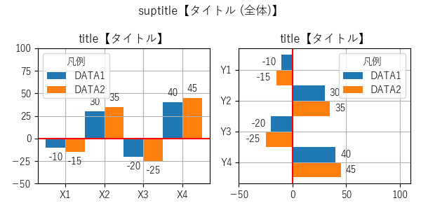
import matplotlib.pyplot as plt

# 初期設定
plt.rcParams['font.family'] = 'sans-serif'
plt.rcParams['font.sans-serif'] =\
    ['Yu Gothic', 'Hiragino Maru Gothic Pro', 'Noto Sans CJK JP']
fig, axs = plt.subplots(
    1, 2,
    figsize=(6, 3),
    tight_layout=True,
)
plt.suptitle('suptitle【タイトル (全体)】')

# bar【棒グラフ (縦)】
WIDTH = 0.5
height_1 = [-10, 30, -20, 40]
height_2 = [-15, 35, -25, 45]
bar_1 = axs[0].bar(
    ['X1', 'X2', 'X3', 'X4'],
    height_1,
    align='edge',
    width=-WIDTH,
    label='DATA1',
)
bar_2 = axs[0].bar(
    ['X1', 'X2', 'X3', 'X4'],
    height_2,
    align='edge',
    width=WIDTH,
    label='DATA2',
)
# バーラベル
axs[0].bar_label(bar_1, padding=5)
axs[0].bar_label(bar_2, padding=5)
# タイトル設定
axs[0].set_title('title【タイトル】')
# y軸表示範囲 設定
axs[0].set_ylim(-50, 100)
# グリッド
axs[0].grid()
# 凡例
axs[0].legend(title='凡例', loc='upper left')
# 水平線 追加
axs[0].axhline(0, color='red')

# barh【棒グラフ (横)】
HEIGHT = 0.5
width_1 = [-10, 30, -20, 40]
width_2 = [-15, 35, -25, 45]
barh_1 = axs[1].barh(
    ['Y1', 'Y2', 'Y3', 'Y4'],
    width_1,
    align='edge',
    height=-HEIGHT,
    label='DATA1',
)
barh_2 = axs[1].barh(
    ['Y1', 'Y2', 'Y3', 'Y4'],
    width_2,
    align='edge',
    height=HEIGHT,
    label='DATA2',
)
# バーラベル
axs[1].bar_label(barh_1, padding=5)
axs[1].bar_label(barh_2, padding=5)
# タイトル設定
axs[1].set_title('title【タイトル】')
# x軸表示範囲 設定
axs[1].set_xlim(-50, 110)
# グリッド
axs[1].grid()
# 凡例
axs[1].legend(title='凡例')
# 垂直線 追加
axs[1].axvline(0, color='red')
# y軸方向反転
axs[1].invert_yaxis()

# 表示
plt.show()